


Guide to Color Theory for Quilters

A lot goes into creating the perfect quilt—it’s not an overnight craft. In fact, it’s better to take your time with projects like these, as you’ll learn about your own creative style and unique nature. To put it simply, a quilt you complete in a day will often result in muddy coloring and boring results. Creating a quilt that both stands out and fits in takes time and planning.
One aspect that has to be thoroughly thought through and planned is your quilt’s color scheme. This is where color theory plays an essential part in your quilt design. If you’re an avid quilter, there’s a chance you got yourself into a color rut, where you go back to the same few colors time and time again. For those beginner quilters, the thought of having to pick the color scheme seems like an absolutely overwhelming task. Fortunately, having an eye for color is something you can learn and improve. To help you on your way to color confidence, we listed some “rules” that tend to help create a quilting masterpiece—check out our guide to color theory for quilters. You won’t regret looking through these general guidelines!
The Color Wheel
The best place to start for anyone hoping to improve their color game is with the color wheel. Learning how to use a basic color wheel will help you choose fabrics for all sorts of quilting projects. It will help you understand the relationship between colors, leading you toward fabrics that will pair best. Remember—this wheel does not dictate which colors you choose, rather it gives you a place to turn to when you need inspiration.
To begin, we’ll go over some of the main words you’ll need to understand.
Primary
Think back to elementary school for this one. Your primary colors are those that you can’t get when mixing colors—they’re the basis for every other color. Red, blue, and yellow are your three primary hues, and you’ll find them arranged at equal distances from each other on the color wheel.
Secondary
Next are secondary colors. Mixing together equal amounts of the nearby primary colors creates these hues, and they’re located midway between their primary counterparts. The colors are as follows:
- Green: mixed from equal parts blue and yellow
- Orange: mixed from equal parts yellow and red
- Violet: mixed from equal parts red and blue
Tertiary/Intermediate
The next set of colors on the wheel are called tertiary or intermediate colors. They don’t have the most creative names, as you create them by combining equal parts of the primary and secondary colors that sit closest to them. They’re as follows:
- Yellow-Green: mixed from equal parts yellow and green
- Yellow-Orange: mixed from equal parts yellow and orange
- Blue-Violet: mixed from equal parts blue and violet
- Blue-Green: mixed from equal parts blue and green
- Red-Orange: mixed from equal parts of orange and red
- Red-Violet: mixed from equal parts red and violet
Analogous
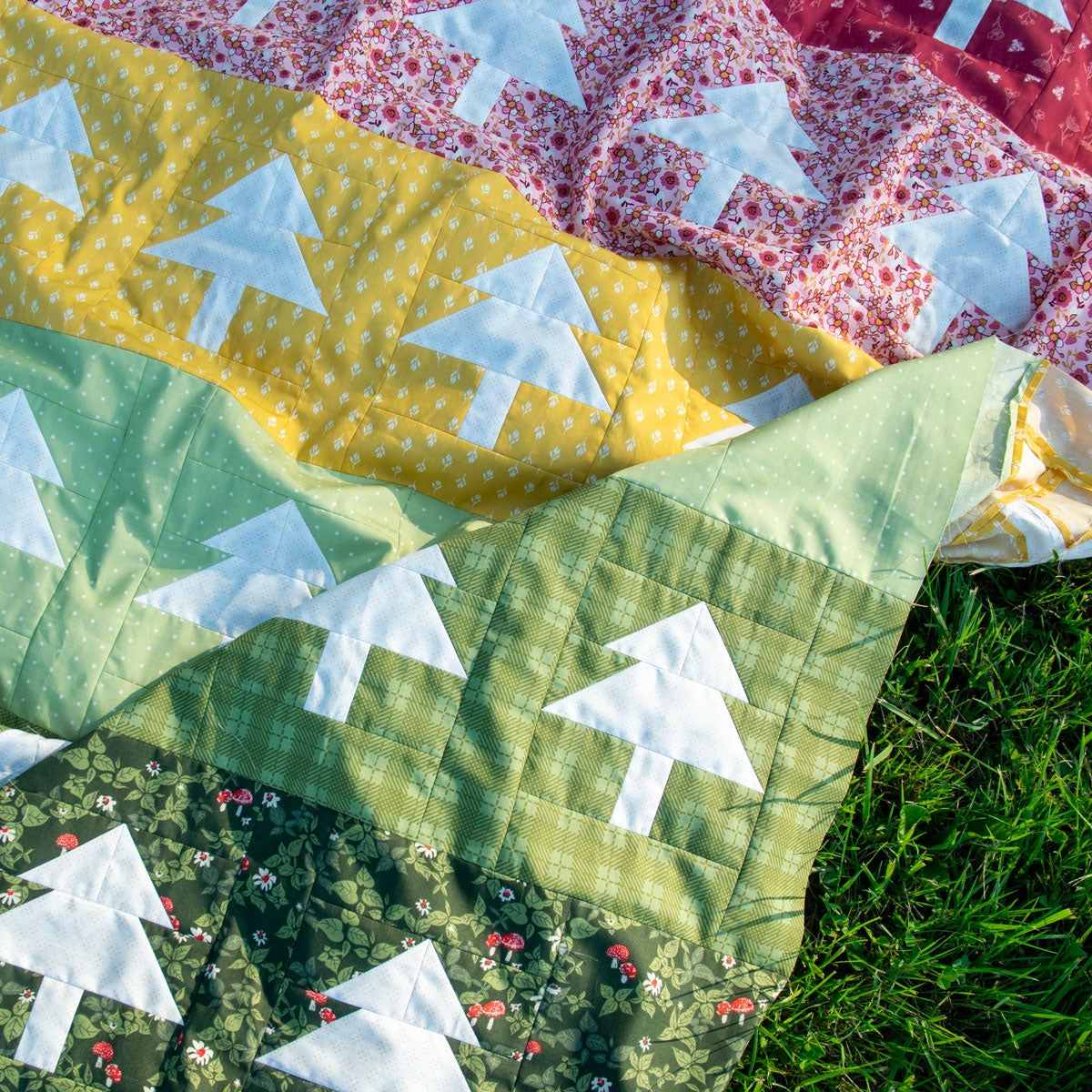
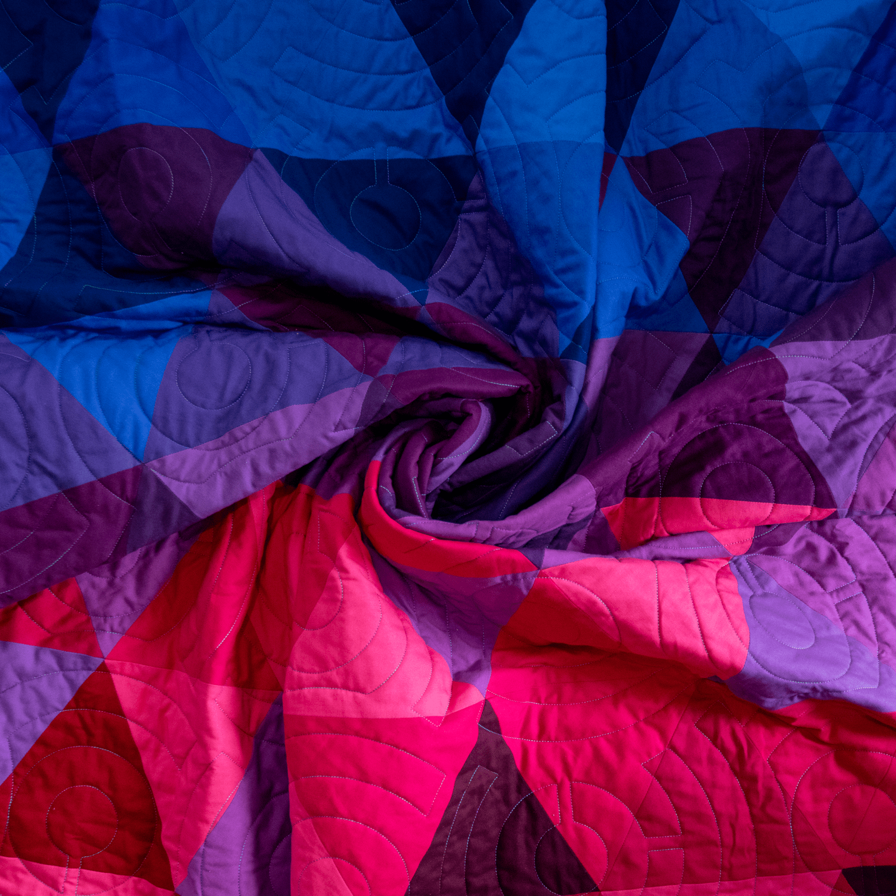
Analogous colors are next to each other in the color wheel. When it comes to quilting, this can be as wide or as narrow of an analogous scheme as you’d like. The scheme would consist of three or more adjacent colors combined—green, blue-green, and blue are just one example.
Complementary
Complementary colors are the opposite of analogous colors, and they are those that sit opposite of one another on the color wheel. This scheme is composed of one primary color and one secondary color. For example, red and green are complementary colors, as are blue and green.
Tint
A tint is made by adding white to a pure color to make it lighter.
Shade
A shade is made by adding black to a pure color to make it darker.
Tone
A tone is made by adding gray to a pure color to make it a less intense version of its pure self.
Value
A color’s value is the darkness and lightness of a color, and it consists of tints, tones, and shades.
Symbolic Color Meanings
It’s also important to keep symbolic color meanings in mind. A lot of quilts contain meaning—whether it’s fabrics from grandparents or just the fact that a finished project shows success. Think about the kind of attitude you want your quilt to give off—do you want it to be bright and buoyant, or more relaxed and subdued? Understanding not just the color wheel but the meanings of the colors themselves can help you create the perfect piece!
White
Purity, perfection, and balance
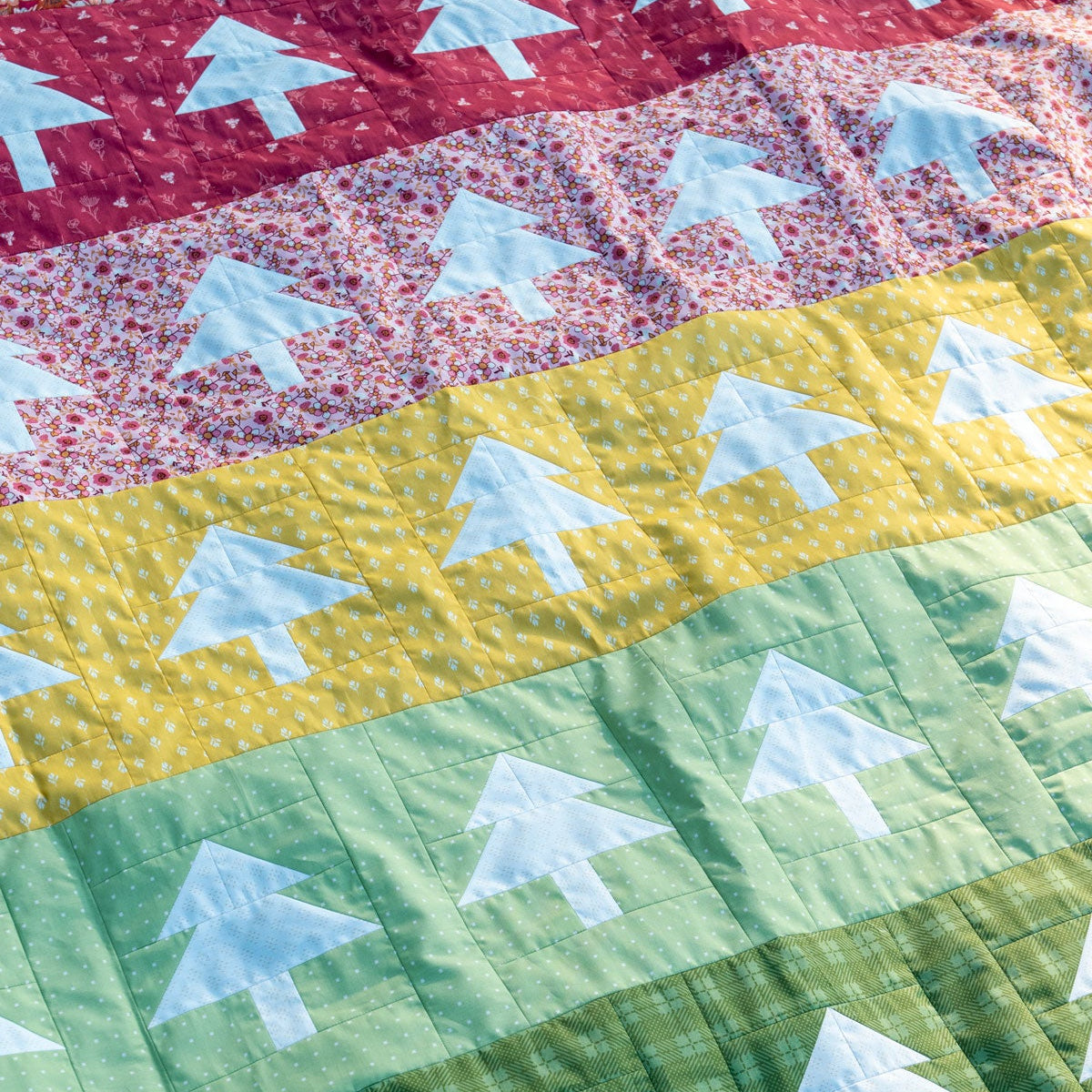
Red
Passion, physical energy, power, and strength
Blue
Wisdom, confidence, serenity, peace, and relaxation
Green
Youth, prosperity, harmony, fertility, and freshness
Yellow
Joy, happiness, energy, cleansing, and intellect
Orange
Similar to yellow, orange is associated with joy, enthusiasm, creativity, success, and stimulation.
Violet
Violet has the stability of blue and the power of red—it symbolizes power, nobility, ambition, magic, and independence.
Fabric Combining Suggestions
The last topic our guide to color theory for quilters covers some common fabric color combinations. These are typical themes that people use when deciding on quilt colors, and we hope it helps you on your way to your own masterpiece.
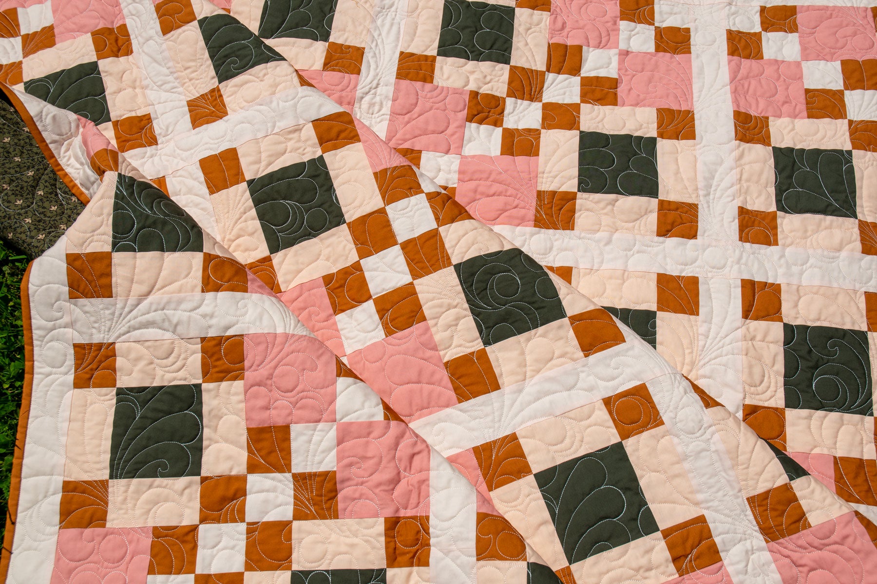
Monochromatic
These are your quilts made from just one color, but that doesn’t mean it needs to be boring. In fact, with help from a color’s “value,” a monochromatic quilt will be quite restful, as long as you contrast colors and patterns.
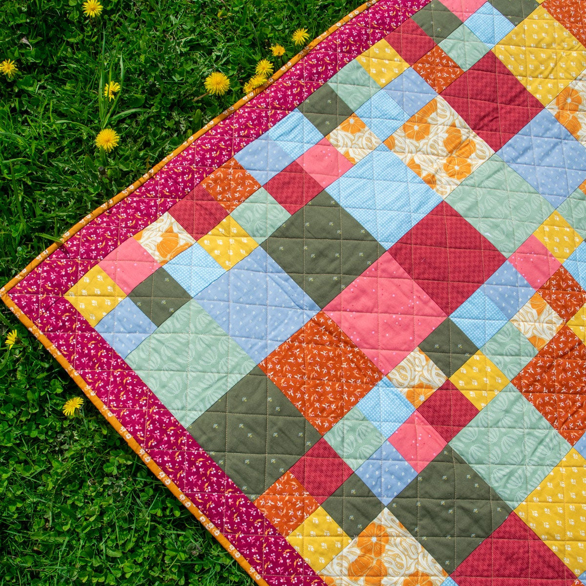
Warm and Cool
A quilt that has a combination of warm and cool colors create an exciting piece. Warm colors (red, yellow, orange) appear more forward than their cooler counterparts (blue, violet, green). Use colors in unequal portions and let one color dominate for quilts with this theme. You can also use neutral colors as the backbone for these quilts.
Light and Dark
This can play under the realm of monochromatic or warm and cool quilt themes. In the simplest sense, thee quilts create a contrast in a quilt, showcasing darker patches and lighter patches, and can help you emphasize certain details and patterns.
Split Complementary
Split complementary is a theme made by selecting three side-by-side (or analogous) colors on the color wheel, and then adding a color that lies directly across the color wheel. For example, this would be violet, blue-violet, red-violet, and then yellow.
Hopefully, this color guide will help you on your way to a quilted masterpiece! From utilizing the color wheel to picking colors based on symbolic meanings, you can make your quilt showcase exactly what you want it to. For all your other quilting needs, turn to Lindley General Store. We have all of the quilting tools you need in Canada. Peruse our color fabrics, seam rippers, and more crafting essentials! We have just what you need to put your best and colorful foot forward!

Comments